In the fifth post of this series, we will learn how to generate commonly used plots in rf engineering using built-in plot methods in the scikit-rf package.
For your reference, here is a list of articles in this series.
Since we have seen how to create and manipulate network data using scikit-rf, visualizing the data is the next logical step. Plotting tools in python are very powerful and most of them take numpy array data or pandas dataframes as input data structures. We will limit ourselves to scikit-rf’s built-in plot functions which uses matplotlib under the hood. The Network() class has methods that are convenient to use for plotting in rectangular, complex, polar and smith projections. We will assume a basic familiarity with plotting functions using the matplotlib module which you can learn more about here, if you are unfamiliar.
Basic Smith Chart
The smith chart is central to RF engineering and is the first plot we will address. We will use our network object nw created from the touchstone file ntwk1.s2p available as part of the scikit-rf install, that we created earlier as part of this series.
1
nw.plot_s_smith()
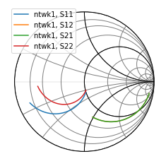 Smith chart in scikit-rf
As simple as that! The plot_s_smith() method plots all the network quantities in the nw object on the smith chart.
In scikit-rf, when no arguments are given to the plot function, all available network parameters are plotted by default.
In a two-port network like the one used here, all four network parameters s11, s12, s21, and s22 are plotted. Also, the name of the network object ntwk1 is used in the plot label.
Exploring Plot Types
Our next plot will be more customized to show the various plot types available in scikit-rf. We will use subplots in matplotlib to create a grid of plots, and plot s-parameter quantities on smith, rectangular, polar and complex plots. The code to generate these plots is as follows.
1
2
3
4
5
6
7
8
9
10
11
12
13
14
15
16
17
18
19
20
21
22
23
24
25
26
27
import matplotlib.pyplot as plt
fig = plt.figure(figsize=(9,8))
ax1 = fig.add_subplot(221)
ax2 = fig.add_subplot(222); ax2.grid()
ax3 = fig.add_subplot(223, projection='polar')
ax4 = fig.add_subplot(224); ax4.grid()

nw.plot_s_smith(m=0,n=0,
                r=1,
                chart_type='z',
                ax=ax1,
                show_legend=True,
                draw_labels=True,
                draw_vswr=True)

nw.plot_s_db(m=1,n=0,
             ax=ax2,
             title='S21 (in dB)')

nw.plot_s_polar(m=0,n=1,
                ax=ax3,
                title='S12 in polar')

nw.plot_s_complex(m=1,n=1,
                  ax=ax4,
                 title='S22 complex plane')
fig.tight_layout()
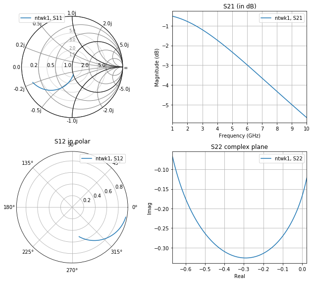 Various plot types available in scikit-rf
We generate four subplots corresponding to each s-parameter quantity that needs to be plotted. The axes handles ax1-ax4 are passed into the plot functions so that we can place the plot appropriately in the plot grid. For the polar plot, the subplot axis handle needs to be created with projection='polar'. Otherwise, the polar plot will show up on rectangular axes when this axis handle (ax3) is passed into the plot function.
We can plot just s11 on the smith chart by setting zero-indexed indices m=0 and n=0 to select it. In the other plots, a similar notation is used to select the various s-parameter quantities. Unlike our earlier smith plot, this one shows other arguments that can be passed into the plot function to customize its display.
- Radius:
r=1sets the radius of the smith chart to 1, which is the default. - Type: The smith chart allows impedance or admittance charts depend on whether
chart_typeis set tozory, respectively. - Axis: We pass in an axis handle through the
axparameter so that we can place the smith chart in the top left subplot graph. - Legend: If you prefer to turn off the legend in cases when only one curve is present, you can set
show_legend=False. - VSWR: A nifty visualization in the smith chart is the inclusion of VSWR circles which is enabled using the
draw_vswr=Truekeyword. - Labels: Setting
draw_labels=Trueshows smith chart axis labels along the real and impedance/admittance axis. It also puts labels on the VSWR circles.
Similarly, you can generate a rectangular plot in decibels, polar or complex forms by simply using plot_s_db, plot_s_polar or plot_s_complex. For each of these plots, you select the appropriate s-parameter using the indices m and n, pass in the appropriate axis handle, and an optional title.
In fact, we can generalize plotting in scikit-rf as follows.
Use the plot_<attribute> method on any network object to generate a rectangular plot of the attribute versus frequency.
The <attribute> can be quantities like s_db, y_im, or z_deg. For example, using the plot_y_im() method will plot imaginary Y-parameters versus frequency. If you need to plot y-parameters on a complex plane instead, you will use the plot_y_complex() method. You can list all the attributes associated with a network object using the dir() function. This makes it rather handy for us to plot any network parameter in the format we want versus frequency without having to deal with network parameter or format conversions ourselves.
One more thing work mentioning here is that network objects do have a plot_it_all() method that plots all the network quantities on different projections. You could use this to quickly plot some data without all the bells and whistles, and use the methods described in this section to generate your final plots with all the proper labels.
Colors, Symbols, Fontsizes
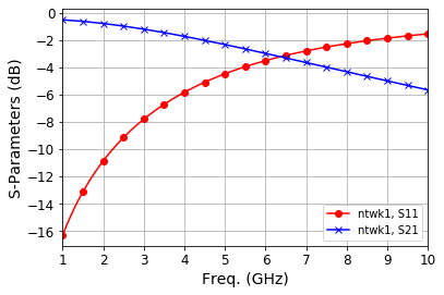
When plotting multiple network parameters on the same plot, it is often necessary to distinguish them by selecting plot colors and symbols. Since the scikit-rf plotting uses matplotlib behind the scenes, all matplotlib options to configure the plot display applies to scikit-rf plots. Let’s say we want to plot s11 and s21 from network nw in the same plot. We can do something like this.
1
2
3
4
5
6
7
8
9
10
fig, ax = plt.subplots()
nw.plot_s_db(m=0, n=0, ax=ax, color='r', marker='o', markevery=5)
nw.plot_s_db(m=1, n=0, ax=ax, color='b', marker='x', markevery=5)

# set display and fontsizes
ax.grid()
ax.set_xlabel('Freq. (GHz)', fontsize=14)
ax.set_ylabel('S-Parameters (dB)', fontsize=14)
ax.tick_params(axis='x', labelsize=12)
ax.tick_params(axis='y', labelsize=12)
 Setting display colors, symbols and axes
In addition to passing in m and n parameters to select the appropriate s-parameter and the ax handle, we can also use all of the Line2D properties available in matplotlib as keyword arguments. Here, we use the keywords color, marker and markevery to select the line color, marker shape and marker frequency. You could use a host of others to control every aspect of the line plot. Setting axis display titles and fontsizes is easily done using methods from the ax object, as shown here for quick reference, since we will often need to adjust these properties before publication of plots.
There you have it! You are now able to create several plots fundamental to RF engineering. Hopefully, this post has been helpful if you are just starting out, or serves as quick reference whenever you need to get plots going with scikit-rf. In the next post, we will explore options for data export from scikit-rf!